The channel in the image of its series
Overview
Modern anti-heroes
- Client
- JIMMY
- Project
- Complete rebrand
- Platform
- TV
Logo
A series of blocs create an intriguing and playful brand.
Grid system
We created a grid that ensured consistency while facilitating in-house production.
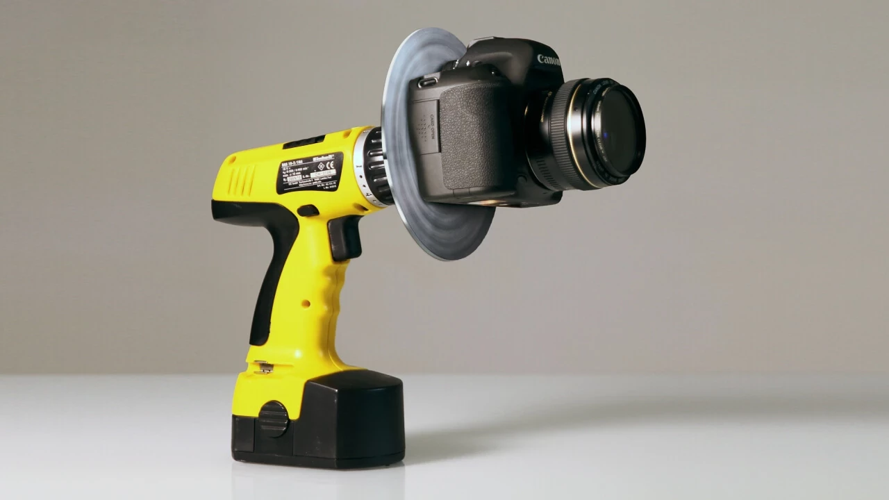
The device
We came up with practical way of morphing the raw material of the channel (the series themselves) into unique moving imagery.

Visual treatment
A camera is mounted onto a drill when rotating at full speed, the extreme circular motion blur creates mesmerizing backplates.
Kinetic
Network ID’s are made of powerful lines from our anti-heroes and strong images from the shows.
Who am I?
Another quiz where the viewer must guess the anti-heroes name based on three clues.
Who said?
A multiple answer quiz asking the viewer who said a certain quote.
Definition
Fun promos bringing a new spin on a word’s definition.
Credits
Client CANAL+ / JIMMY
Concept / Production Ramon + Pedro
Creative directors Antoine Tinguely / Laurent Fauchère
Account director Christine Gaulis