Mezzo TV Branding: Giving Music the Best Place on Screen
Overview
Perfect pitch
- Client
- MEZZO
- Project
- Complete rebrand
- Platform
- TV / Print / Digital
Brief - rebranding & on-air branding
Creative approach
Mezzo logo: design of the logotype and symbol
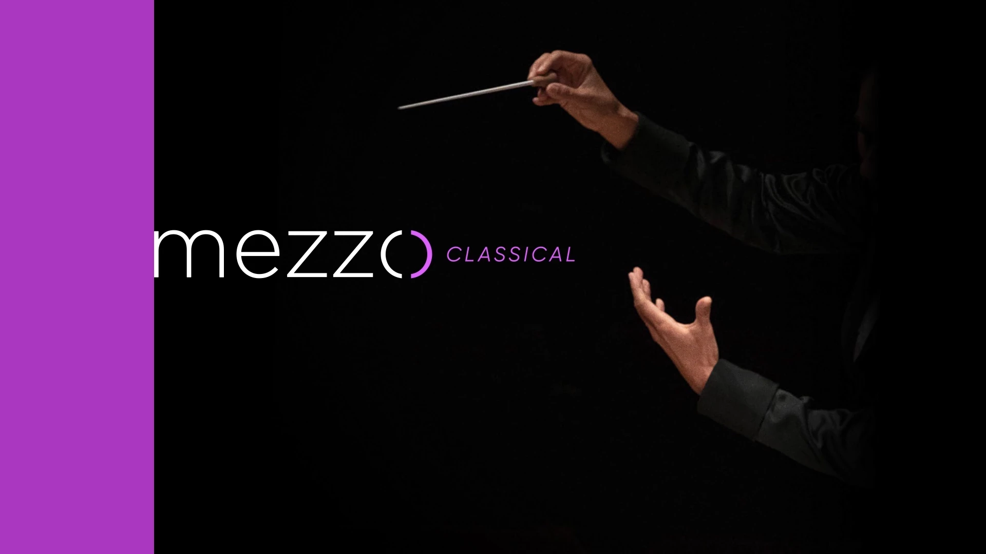
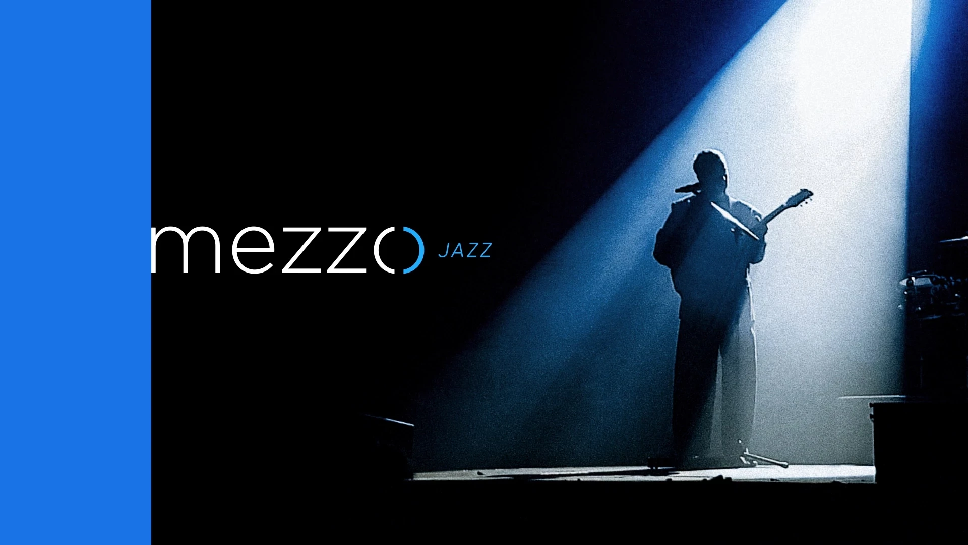
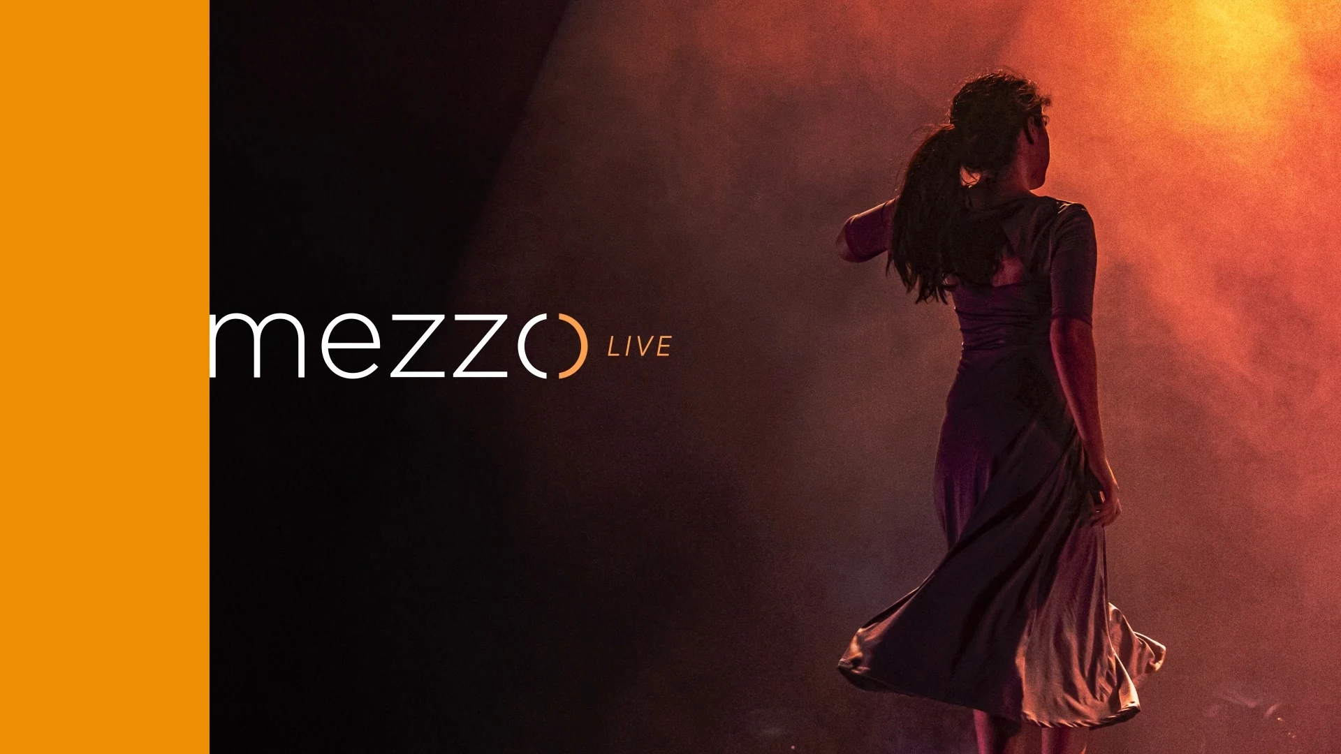
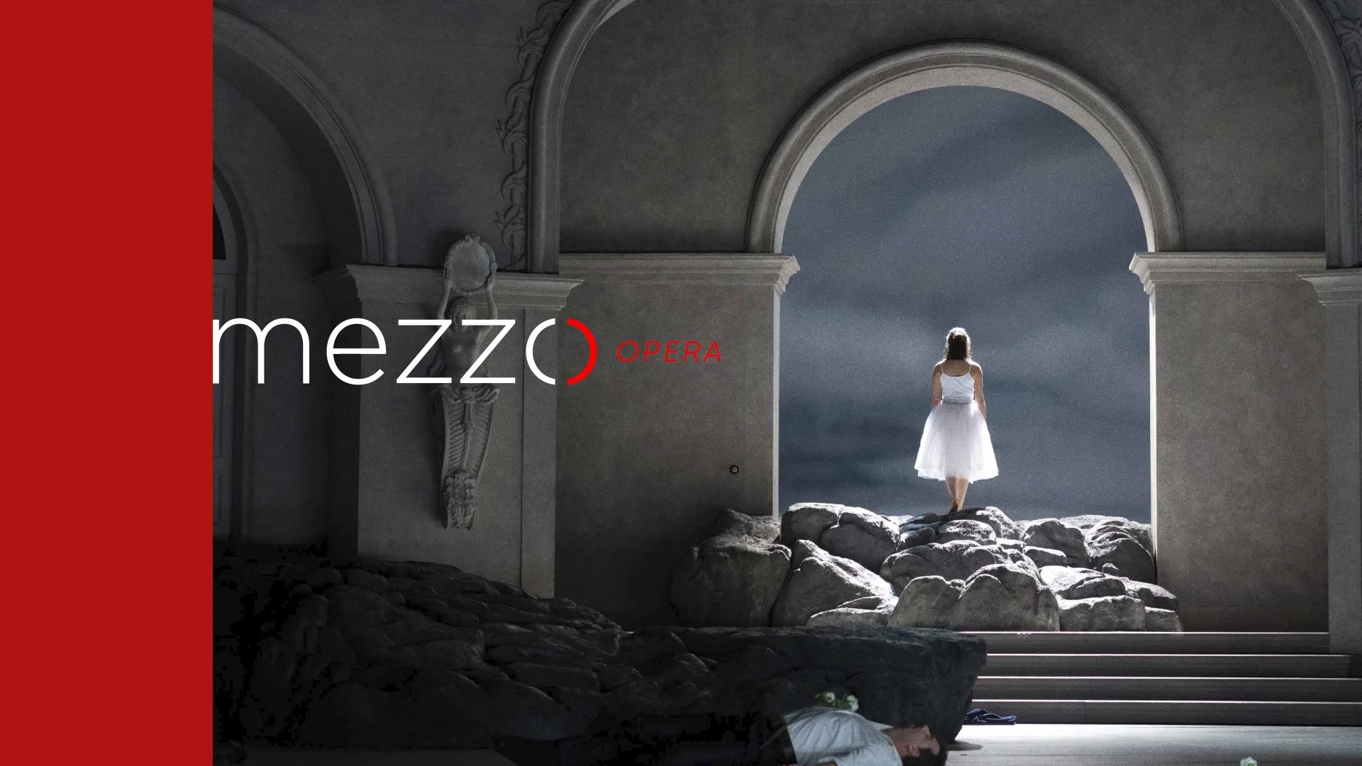
The new logo was designed to reflect the channel’s renewed vision. Built around a modern, dynamic typeface, the “O” in “Mezzo” stands out: it symbolizes the viewers’ ears, becoming a strong and distinctive element of the overall identity.
Opening: TV credits & animated logo
The logo truly comes to life through animation. The space created between the “ears” becomes a category container. Each category is highlighted through its own color, making this symbol the beating heart of the channel.
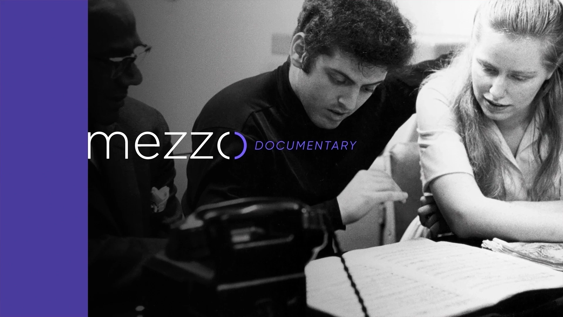
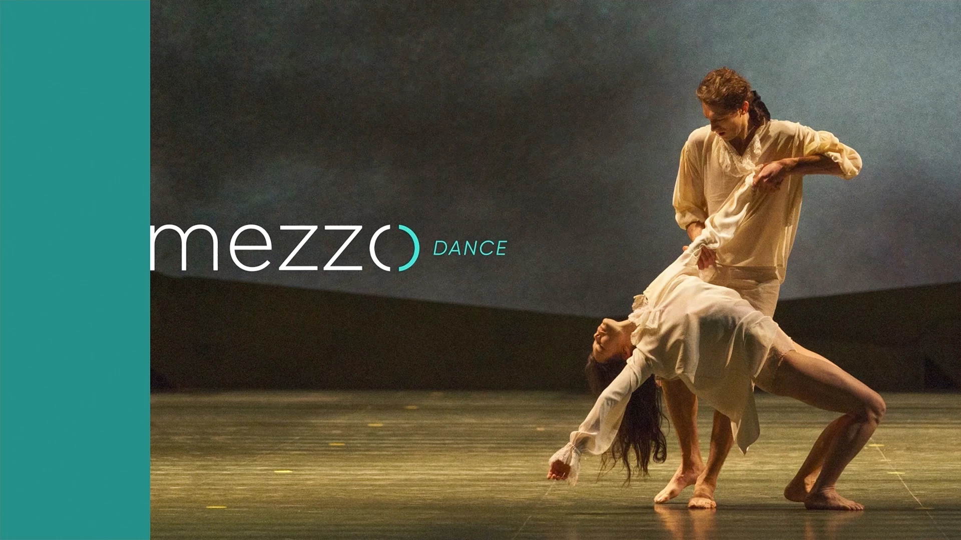
On-air graphics: modular graphic system
The project was designed so that every element, titles as well as visuals, can be modular and quickly adapted in a logical and efficient way.
Expertise involved
Artistic direction
TV branding / broadcast design
Visual identity
Design system & templates
Multi-media adaptations (TV / web / print)
Post-production coordination
Ramon & Pedro supports TV channels, platforms and entertainment companies in creating bespoke visual identities and on-air graphics.
Do you have a similar project? Contact us to discuss it, we will be happy to assist you.
Credits
Client Mezzo
Concept / Production Ramon + Pedro
Creative directors Antoine Tinguely / Laurent Fauchère
Account director Tanya Weber
Post Production
Motion Design Felix Helfer
Sound Brian Bendahan